Does my model work? Crossvalidation, bootstrap, and friends
Cross-validation & the bootstrap
- We will discuss two resampling methods: cross-validation and the bootstrap.
- These methods refit a model with samples from the training set to obtain additional information about the fitted model.
- For example, they provide estimates of test-set prediction error, or the standard deviation and bias of our parameter estimates.
Training error vs. test error
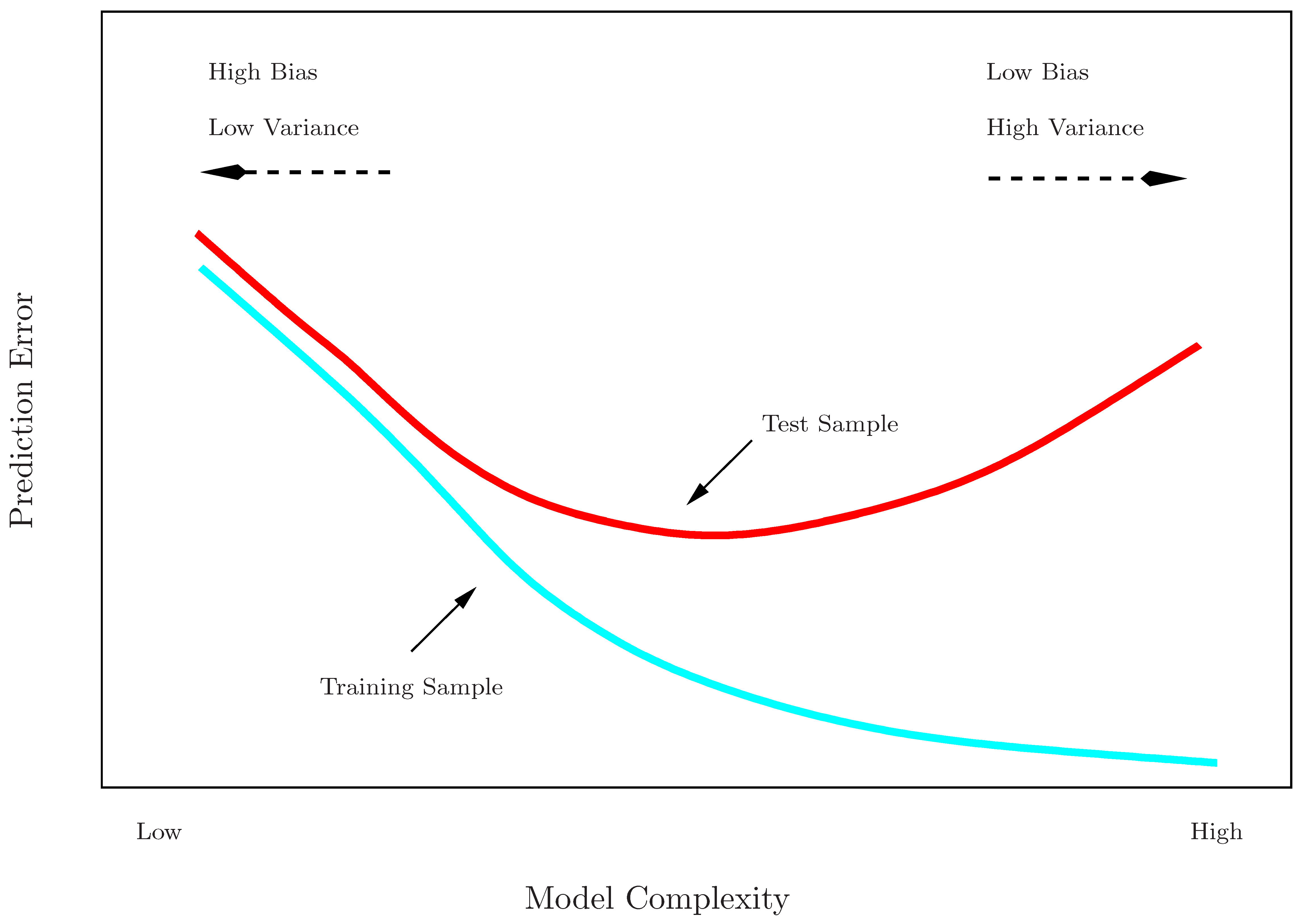
- Recall the distinction between the test error and the training error:
- The test error is the average error that results from using a statistical learning method to predict the response on a new observation, one that was not used in training the method.
- In contrast, the training error can be easily calculated by applying the statistical learning method to the observations used in its training.
- The training error rate often is quite different from the test error rate.
- The former can dramatically underestimate the latter.
Training- vs. test-set performance
More on prediction-error estimates
- Best solution: An infinitely large designated test set. Not feasible.
- Some methods make a mathematical adjustment to the training error rate to estimate the test error rate. These include the Cp statistic, AIC and BIC.
- Here we instead consider a class of methods that estimate the test error by holding out a subset of the training observations from the fitting process, and then applying the statistical learning method to those held out observations
Validation-set approach
- Here we randomly divide the available set of samples into two parts: a training set and a validation or hold-out set.
- The model is fit on the training set, and the fitted model is used to predict the responses for the observations in the validation set.
- The resulting validation-set error provides an estimate of the test error. This is typically assessed using MSE in the case of a quantitative response and misclassification rate in the case of a qualitative (discrete) response.
The validation process

A random splitting into two halves: left part is training set, right part is validation set
Example: automobile data
- Want to compare linear vs higher-order polynomial terms in a linear regression
- We randomly split the 392 observations into two sets, a training set containing 196 of the data points, and a validation set containing the remaining 196 observations.

Left panel shows single split; right panel shows multiple splits
Drawbacks of validation set approach
- The validation estimate of the test error can be highly variable, depending on precisely which observations are included in each set.
- In the validation approach, only a subset of the observations — those that are included in the training set rather than in the validation set — are used to fit the model.
- This suggests that the validation set error may tend to overestimate the test error for the model fit on the entire data set.
- Why?
K-fold cross-validation
- Widely used approach for estimating test error.
- Estimates can be used to select best model, and to give an idea of the test error of the final chosen model.
- Idea is to randomly divide the data into \(K\) equal-sized parts. We leave out part \(k\), fit the model to the other \(K-1\) parts (combined), and then obtain predictions for the left-out \(k\)th part.
- This is done in turn for each part \(k = 1,2,\ldots K\), and then the results are combined.
K-fold cross-validation in detail
| Fold | Part 1 | Part 2 | Part 3 | Part 4 | Part 5 |
|---|---|---|---|---|---|
| 1 | Validation | Train | Train | Train | Train |
| 2 | Train | Validation | Train | Train | Train |
| 3 | Train | Train | Validation | Train | Train |
| 4 | Train | Train | Train | Validation | Train |
| 5 | Train | Train | Train | Train | Validation |
The details
- Let the \(K\) parts be \(C_1,C_2,\ldots C_K\), where \(C_k\) denotes the indices of the observations in part \(k\). There are \(n_k\) observations in part \(k\): if \(n\) is a multiple of \(K\), then \(n_k = n/K\).
- Compute: \[CV_{(K)} = \sum^{K}_{k=1} \frac{n_k}{n} MSE_k\]
- Where \(MSE_k = \sum_{i\in C_k} (y_i - \hat{y}_i)^2/n_k\)
- \(\hat{y}_i\) is the prediction for observation \(i\) when its fold was removed from training.
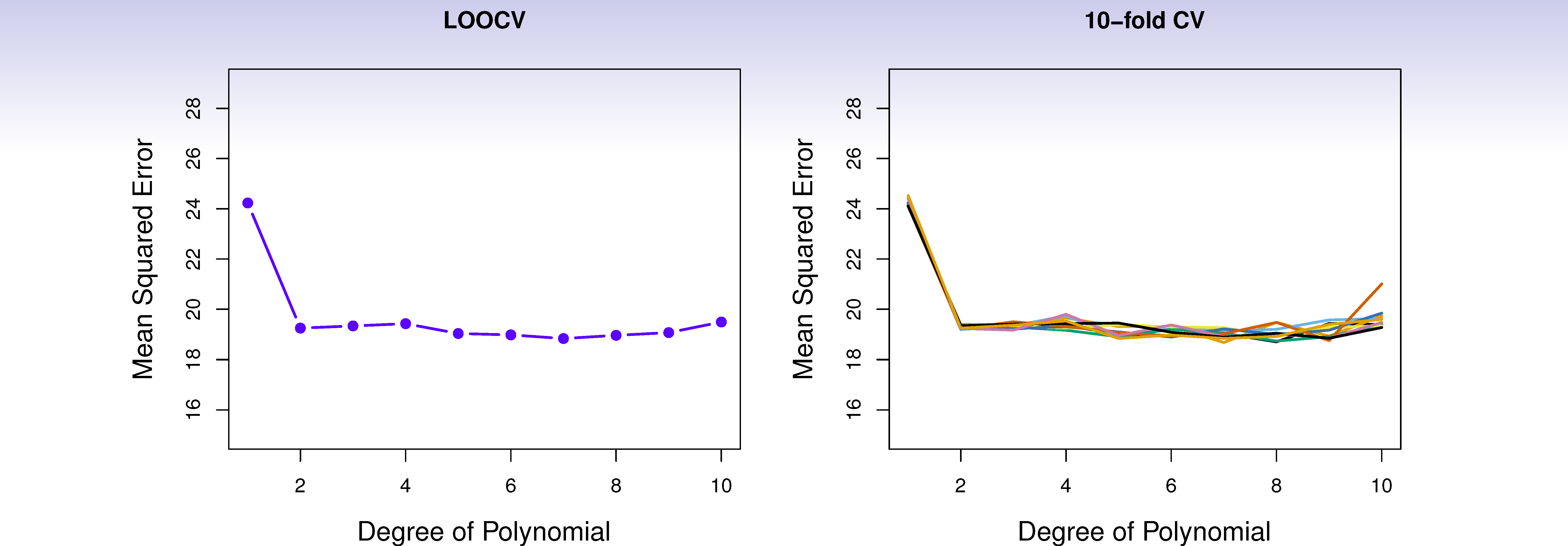
- Setting \(K = n\) yields leave-one out cross-validation (LOOCV). LOOCV uses nearly all the data for training, minimizing bias, but the estimates across folds come from nearly-identical training sets and are therefore highly correlated — leading to high variance in the overall error estimate.
Auto data revisited
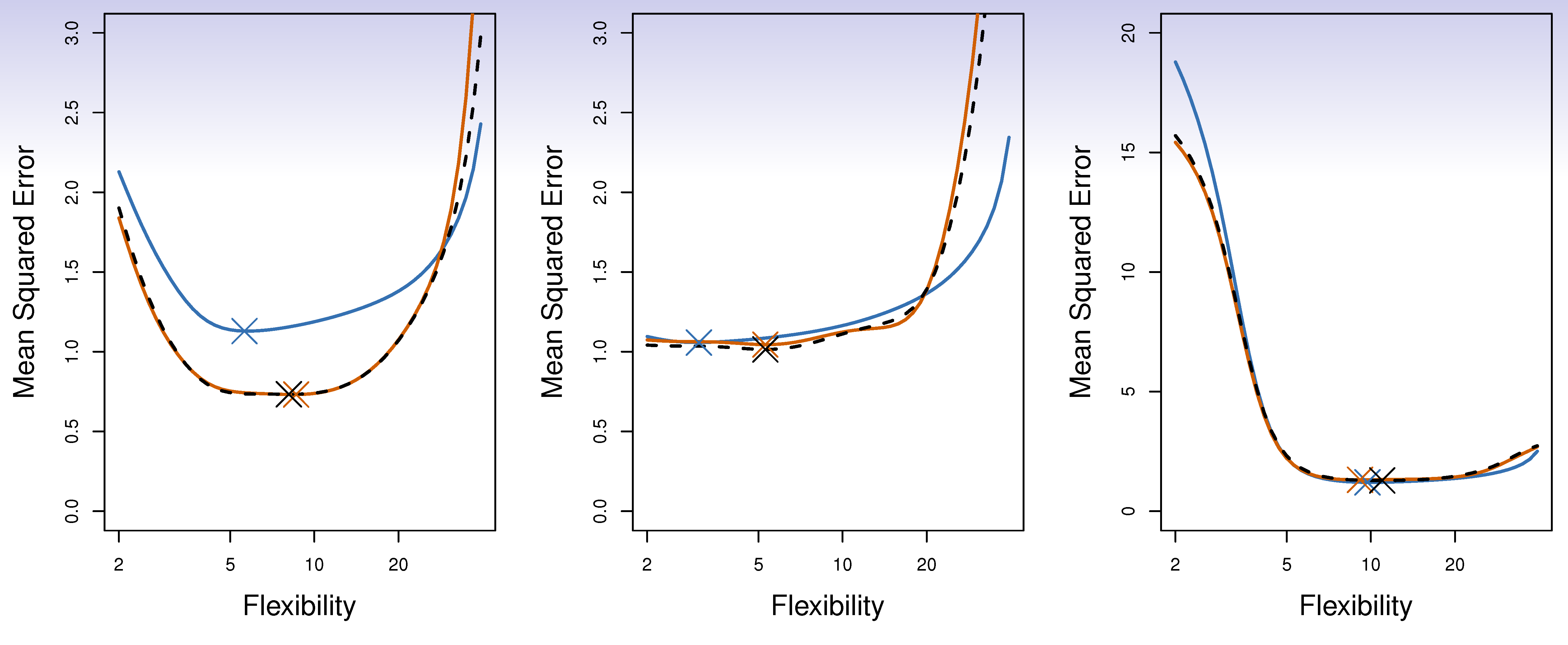
True and estimated test MSE for the simulated data
Other issues with cross-validation
- Since each training set is only \((K - 1)/K\) as big as the original training set, the estimates of prediction error will typically be biased upward. Why?
- This bias is minimized when \(K = n_{(LOOCV)}\), but this estimate has high variance, as noted earlier.
- \(K = 5\)–\(10\) provides a good compromise.
Cross-validation: right and wrong
- Consider a simple classifier applied to some two-class data:
- Starting with 5000 predictors and 50 samples, find the 100 predictors having the largest correlation with the class labels.
- We then apply a classifier such as logistic regression, using only these 100 predictors.
- How do we estimate the test set performance of this classifier?
- Can we apply CV in step 2, forgetting about step 1?
NO!
- This would ignore the fact that in Step 1, the procedure has already seen the labels of the training data, and made use of them. This is a form of training and must be included in the validation process.
- It is easy to simulate realistic data that is completely randomized, so that it is not possible to make any prediction, but the CV error estimate that ignores Step 1 is zero!
- This error is made in many biomedical studies.
The wrong and right way
- Wrong: Apply cross-validation in step 2.
- Right: Apply cross-validation across steps 1 and 2.
Nested cross-validation
- When you tune hyperparameters and want an honest estimate of generalization error, a single CV loop does both — but the chosen model was selected based on the same folds used to estimate error, producing an optimistic bias.
- Nested CV separates the two concerns:
- Outer loop: holds out a test fold to estimate generalization error.
- Inner loop: runs a full CV on the remaining data to select hyperparameters.
- The outer error estimate is unbiased because the test fold never influenced model selection.
- Computationally expensive (\(K_{\text{outer}} \times K_{\text{inner}}\) fits), but essential when comparing models that were tuned to the data.
The Bootstrap
- Cross-validation resamples by partitioning — it asks how well the model generalizes to held-out data.
- The bootstrap resamples with replacement and serves a complementary purpose: quantifying the uncertainty of an estimate itself.
- The bootstrap is a flexible and powerful statistical tool that can be used to quantify the uncertainty associated with a given estimator or statistical learning method.
- For example, it can provide an estimate of the standard error of a coefficient, or a confidence interval for that coefficient.
Where does the name come from?
The use of the term bootstrap derives from the phrase to pull oneself up by one’s bootstraps, widely thought to be based on one of the 18th century “The Surprising Adventures of Baron Munchausen” by Rudolph Erich Raspe:
The Baron had fallen to the bottom of a deep lake. Just when it looked like all was lost, he thought to pick himself up by his own bootstraps.
It is not the same as the term “bootstrap” used in computer science meaning to “boot” a computer from a set of core instructions, though the derivation is similar.
Now back to the real world
- The procedure outlined above cannot be applied, because for real data we cannot generate new samples from the original population.
- However, the bootstrap approach allows us to use a computer to mimic the process of obtaining new data sets.
- Rather than repeatedly obtaining independent data sets from the population, we instead obtain distinct data sets by repeatedly sampling observations from the original data set with replacement.
- Each of these “bootstrap data sets” is created by sampling with replacement, and is the same size as our original dataset. As a result some observations may appear more than once in a given bootstrap data set and some not at all.
Example with just three observations
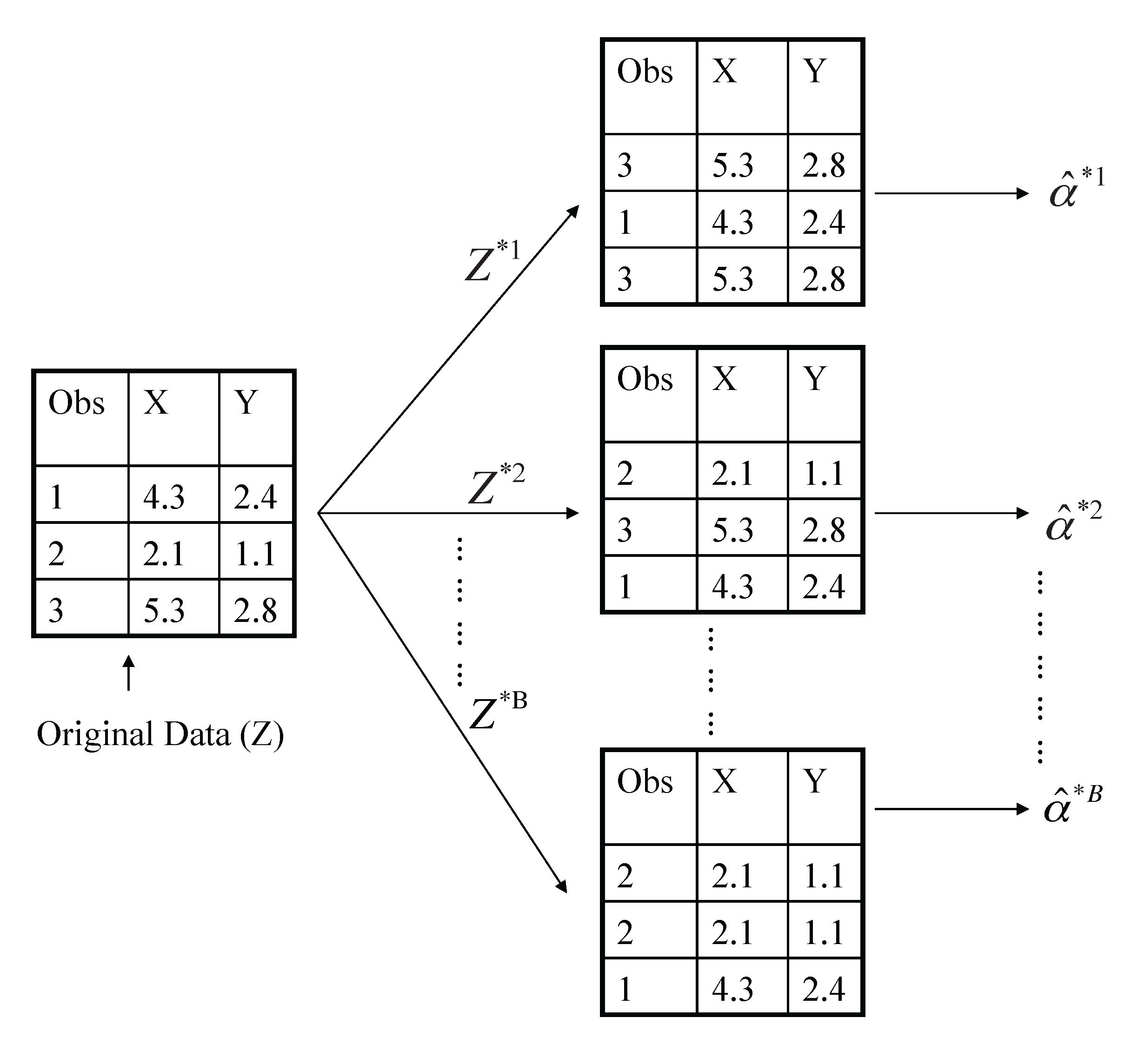
A graphical illustration of the bootstrap approach on a small sample containing \(n = 3\) observations. Each bootstrap data set contains \(n\) observations, sampled with replacement from the original data set. Each bootstrap data set is used to obtain an estimate of \(\alpha\).
Example with just three observations
- Denoting the first bootstrap data set by \(Z^{*1}\), we use \(Z^{*1}\) to produce a new bootstrap estimate for \(\alpha\), which we call \(\hat{\alpha}^{*1}\)
- This procedure is repeated \(B\) times for some large value of \(B\) (say 100 or 1000), in order to produce \(B\) different bootstrap data sets, \(Z^{*1},Z^{*2},\ldots ,Z^{*B}\), and \(B\) corresponding \(\alpha\) estimates, \(\alpha^{*1},\alpha^{*2},\ldots,\alpha^{*B}\).
- We can now calculate summary statistics, like the standard error, by running this calculation across the bootstrap samples.
A general picture for the bootstrap
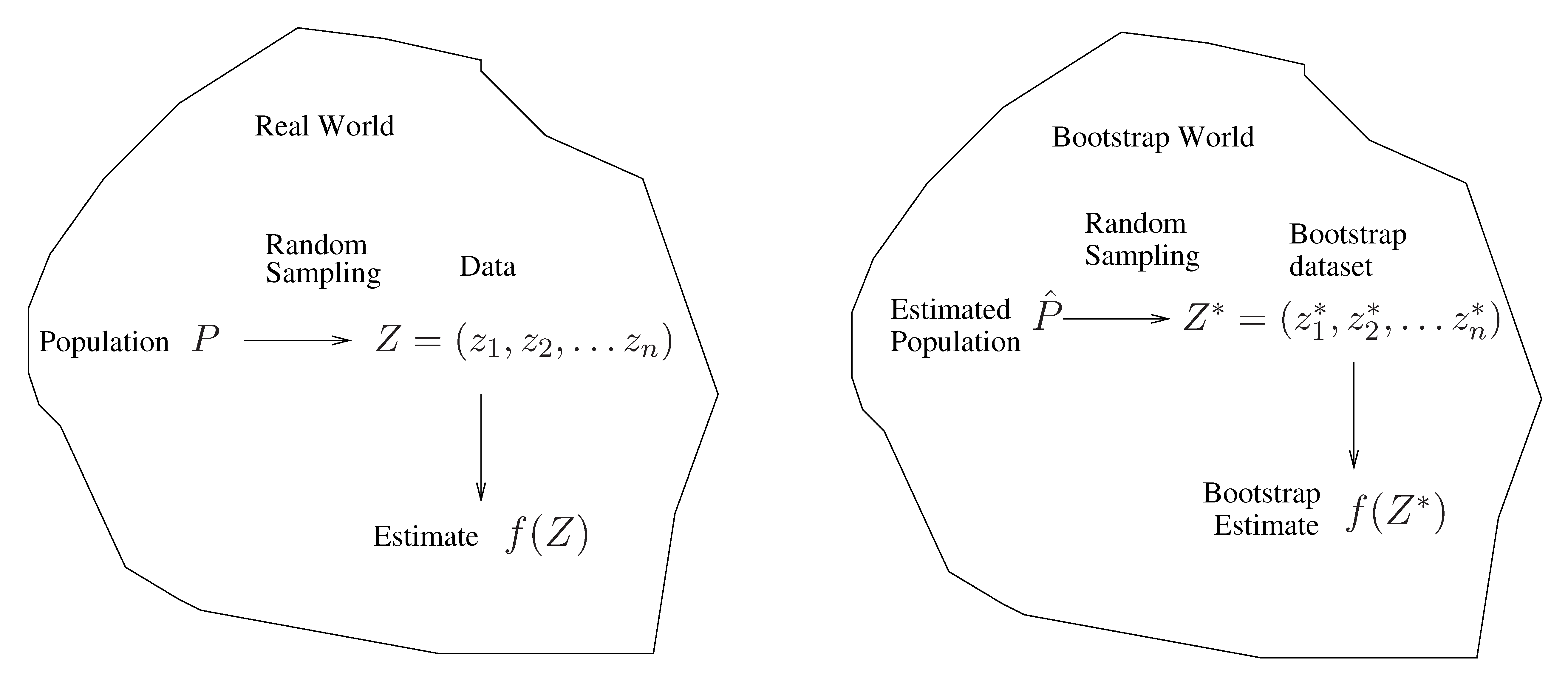
The bootstrap in general
- In more complex data situations, figuring out the appropriate way to generate bootstrap samples can require some thought.
- For example, if the data is a time series, we can’t simply sample the observations with replacement (why not?).
- We can instead create blocks of consecutive observations, and sample those with replacements. Then we paste together sampled blocks to obtain a bootstrap dataset.
Other uses of the bootstrap
- Primarily used to obtain standard errors of an estimate.
- Also provides approximate confidence intervals for a population parameter.
- The above interval is called a Bootstrap Percentile confidence interval. It is the simplest method (among many approaches) for obtaining a confidence interval from the bootstrap.
Can the bootstrap estimate prediction error?
- In cross-validation, each of the \(K\) validation folds is distinct from the other \(K-1\) folds used for training: there is no overlap. This is crucial for its success. Why?
- To estimate prediction error using the bootstrap, we could think about using each bootstrap dataset as our training sample, and the original sample as our validation sample.
- But each bootstrap sample has significant overlap with the original data. About two-thirds of the original data points appear in each bootstrap sample. The probability that a given observation is not selected in a single draw is \((1 - 1/n)\). Over \(n\) draws, the probability it never appears is \((1 - 1/n)^n \to e^{-1} \approx 0.368\) as \(n \to \infty\), so roughly \(1 - 0.368 = 63.2\%\) of observations appear in each bootstrap sample.
- This will cause the bootstrap to seriously underestimate the true prediction error. Why?
Removing the overlap
- Can partly fix this problem by only using predictions for those observations that did not (by chance) occur in the current bootstrap sample.
- But the method gets complicated. In the end, cross-validation provides a simpler, better approach for estimating prediction error.
The bootstrap vs. permutation tests
- The bootstrap samples from the estimated population, and uses the results to estimate standard errors and confidence intervals.
- Permutation methods sample from an estimated null distribution for the data, and use this to estimate p-values and False Discovery Rates for hypothesis tests.
- The bootstrap can be used to test a null hypothesis in simple situations. For example, if \(\theta = 0\) is the null hypothesis, we check whether the confidence interval for \(\theta\) contains zero.
Example: Prognostic gene expression signatures

Random gene expression signatures are associated with survival

Figure 1. Association of negative control signatures with overall survival. In plots A-C the NKI cohort was split into two groups using a signature of post-prandial laughter (panel A), localization of skin fibroblasts (panel B), social defeat in mice (panel C). In panels A-C, the fraction of patients alive (overall survival, OS) is shown as a function of time for both groups. Hazard ratios (HR) between groups and their associated p-values are given in bottom-left corners. Panel D depicts p-values for association with outcome for all MSigDB c2 signatures and random signatures of identical size as MSigDB c2 signatures.
Random signatures often do better than the published ones
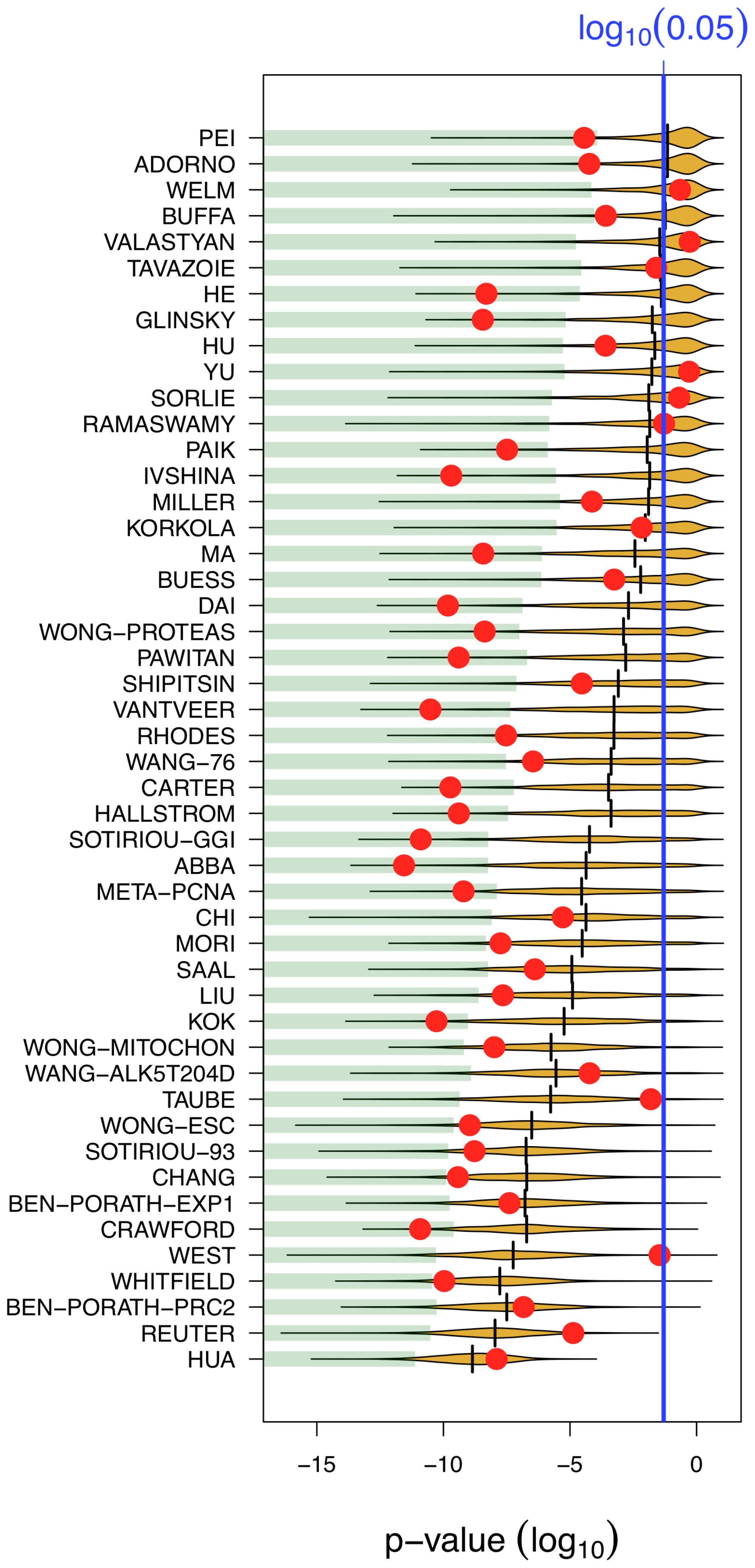
Figure 2. Most published signatures are not significantly better outcome predictors than random signatures of identical size. The x-axis denotes the p-value of association with overall survival. Red dots stand for published signatures, yellow shapes depict the distribution of p-values for 1000 random signatures of identical size, with the lower 5% quantiles shaded in green and the median shown as black line. Signatures are ordered by increasing sizes.
Many signatures simply correlate with cell proliferation
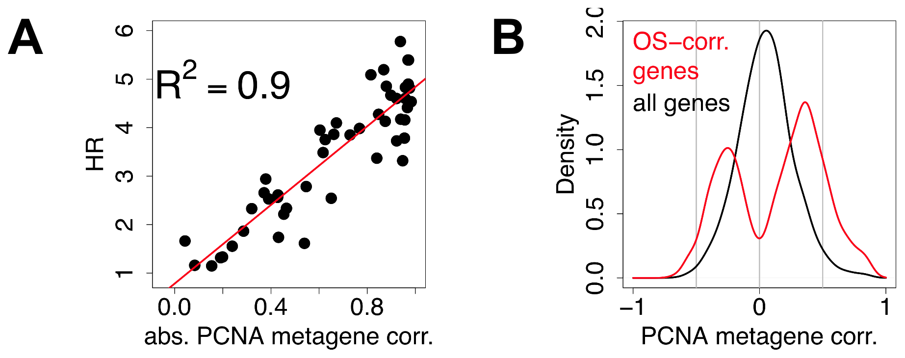
Figure 4. Most prognostic transcriptional signals are correlated with meta-PCNA. A) Each point denotes a signature. The x-axis depicts the absolute value of the correlation of the first principal component of the signatures with meta-PCNA, the y-axis depicts the hazard ratio for outcome association. Details of the analysis for each data point are available in the Supporting Information (Text S1). B) Distribution of the correlations of individual genes with meta-PCNA, for genes significantly associated with overall survival (red) and for all the genes spotted on the microarrays (black).
Implementation
Implementation: Easiest
sklearn.model_selection.cross_val_score
estimator: estimator object implementing ‘fit’X: array-likey: array-like, optional, default: Nonegroups: array-like, with shape (n_samples,), optionalscoring: string, callable or None, optional, default: Nonecv: int, cross-validation generator or an iterable, optionaln_jobs: integer, optional
Use cross_val_predict instead when you need the out-of-fold predictions themselves (e.g., for calibration plots or stacking) rather than just a summary score.
Implementation: Iterators
sklearn.model_selection.KFold(n_splits=3, shuffle=False, random_state=None)sklearn.model_selection.LeaveOneOut()sklearn.model_selection.StratifiedKFold(n_splits=5)— preserves class proportions in each fold; important for imbalanced classification problems where an unlucky split could place all minority-class examples in training or validation.
All use loop for train_index, test_index in kf.split(X):.
get_n_splits provides number of iterations that will occur.
Implementation: Bootstrap
Summary
- Randomization and hiding things are the key to success!
- Crossvalidation hides parts of the data at each step, to see how the model can predict it.
- Bootstrap generates “new” data by resampling, to get a distribution of models.
- With all model evaluation, think about what your model should be “learning”, and mess with that.
- Models that always work, or work unexpectedly well, should be suspicious.
Reading & Resources
Review Questions
- What does cross-validation aim to achieve? What does it pretend to do to achieve this?
- What does bootstrapping aim to achieve? What does it pretend to do to achieve this?
- Why does cross-validation need to be performed across multiple folds?
- How will the process of cross-validation influence the model fit error we observe? How does it affect the model prediction error?
- We want to demonstrate that we can predict the time until failure for an artificial heart from a set of clinical measurements. We plan to utilize LASSO regression to develop this prediction model and are interested in the variables selected by LASSO. Walk through the steps to implement cross-validation here. How can you ensure you select only one set of variables?
- List two ways in which cross-validation and bootstrap are similar.
- List two ways in which cross-validation and bootstrap are different.
- Why is performing variable selection outside of your cross-validation loop bad, but it’s OK to decide what you are going to measure in the first place?
- You want to determine whether the first parameter in your ordinary least squares model, \(\beta_1\), is significantly non-zero. How can you apply bootstrap to accomplish this?
- Say you build a model with no unknown parameters and therefore no degrees of freedom. Do you need cross-validation to know the prediction error?
- Is it alright to adjust your model to improve the cross-validation error? Why/why not? If not, what would you need to do to fix the situation?